Content Warning
Alright, that made me laugh out loud.
Content Warning
Content Warning
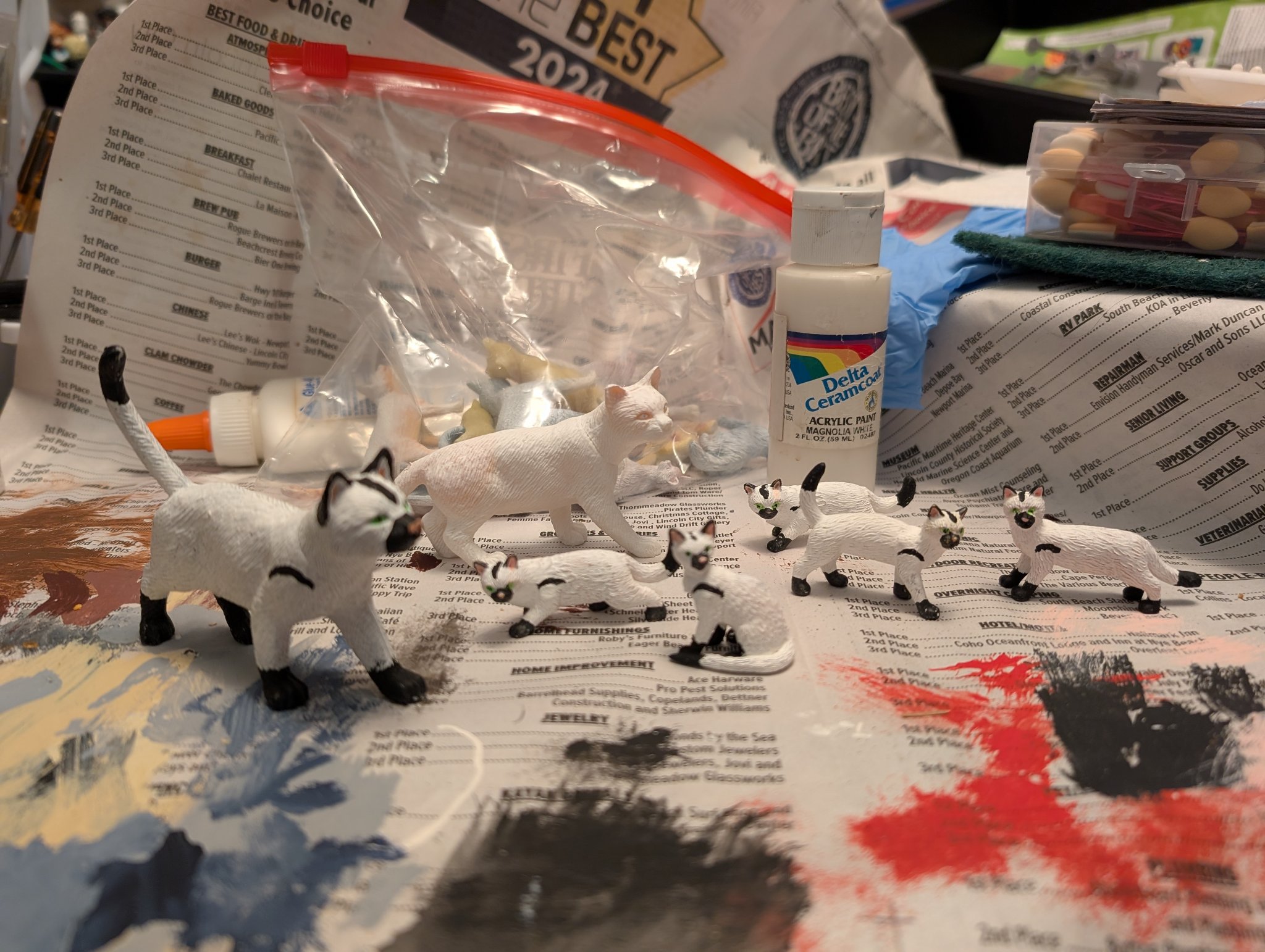
One ongoing element of my comics is that most of them incorporate one or more "Minion Cats," even if they aren't integral to the plots or jokes of that comic. The premise is that, due to a lab accident, Minion cat (there was originally only one) has become in space, time, and now, the multiverse, and they pop in and out of existence at will, sometimes "many" of them at once.The cats are “played” by hand painted and sometimes customized plastic cat figures decorated in a “Minion uniform” pattern. The originals originated as a bag of toy cats I ordered from Amazon. Later, I ordered a whole BOX of the same cats from a seller who supplies prizes and favors to carnivals and fairs. With extras, I started cutting them up, swapping parts, and adding limited articulation to some like turning heads and movable tails. A few others are actually 3D printed.
But before I found that carnival supplier, I ordered a lot of other cats on-line hoping for alternate poses to use. Instead, I discovered that most listing for these things are vague or inaccurate in describing the size, and ended up with several assortments of cats that were too small. And thus, came the idea for "minion kittens." I started painting a few, and finished exactly one, before putting it aside as being very difficult. My hands aren't that steady, some some of the "Minion" pattern is pretty fidgety.
But recently I discovered "brush tip" markers for art and calligraphy and wondered if they could be used for painting details on action figures. Tonight I tried it out, and so far, pretty good. I made some slips, but it made it MUCH easier to paint the details on the smaller cats. I don't know of the paint will fade or rub off. Only time and further experiments will tell. But I'm happy with things so far.
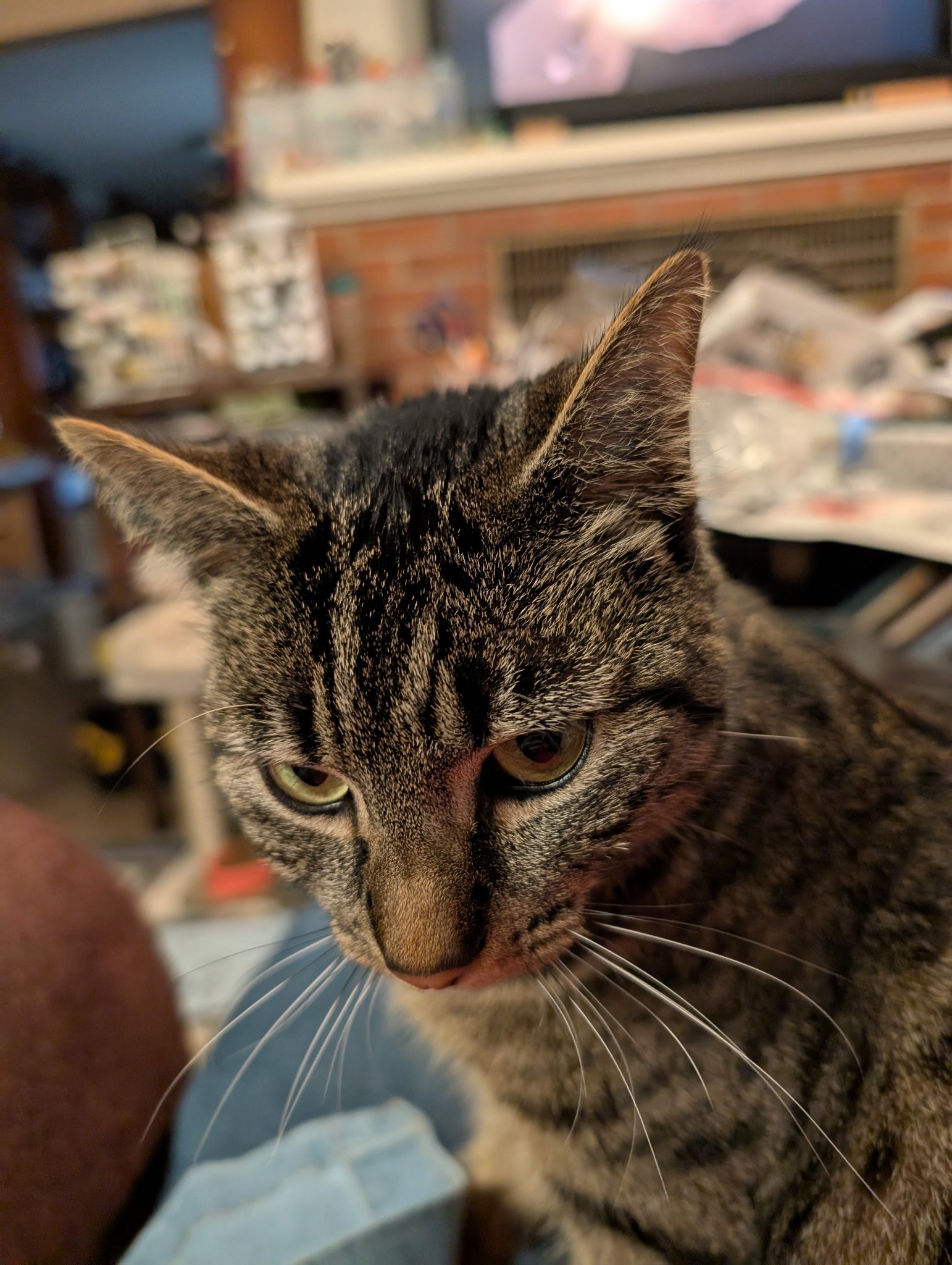
In related news, I today and realized that our new shorthair cat, Notty, is a very good physical match for Minion cat. I pulled out a tape measure and sure enough, she's an almost exact scale match for her 1/6th scale counterparts. I can use photo reference of her to design future custom cats, and to figure out better carrying positions and poses for my 12" action figure characters. I asked my wife if that made Notty tax deductible, but she just laughed...#minionsatwork #pulphousefictionmagazine #Minioncats #notmycat #nottycat #catstodon #catsofmastodon #cats #minatures #comics #photocomicsl
Content Warning
#fiction #anime #manga #tv #television#VideoGames#TTRPGs#CCG #games#SciFi#Fantasy #books #comics #superheroes #film #movies #books#QuestionOfTheDay
Content Warning
Content Warning
So if you post about
#knitting
#sewing
#woodworking
#woodturning
#art
#drawing
#hiking
#travel
#cooking
#photography
#writing
#books
#comics
#ttrpg
#nintendoswitch
#gaming
#cozygames
#startrek
#starwars
#geek
#geekstuff
I'm interested in following! 👋
Content Warning
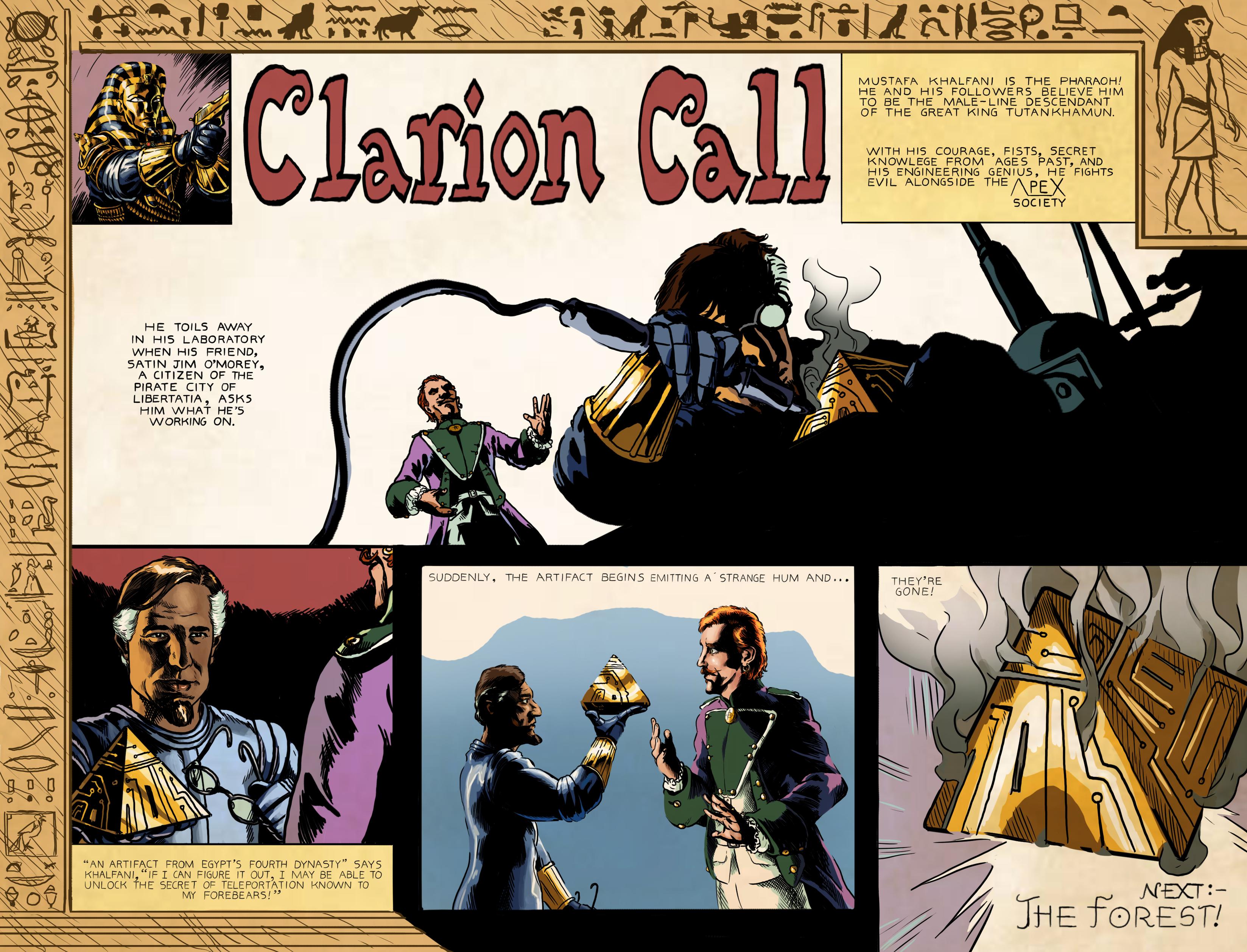
#sundaecomics #webcomic #comics #ClimateChange #SciFi #dystopia
Content Warning
Content Warning

I was just thinking how people completely miss out on one of the most interesting aspects of this comic series. Marvel Star Wars ran for 108 issues, concluding in 1986. But at the beginning the first few issues adapted Episode IV A New Hope, or as it was then known “Star Wars” into comic form.
But the interesting thing was that it was not adapting the movie as such, it was clearly working from the screenplay, as there are scenes in there that never got used, and the designs of the movie were not finalized yet, so we encounter lots of interesting things in there which never, or nearly never, showed up again. These get less over the course of the adaption already, but the usual Marvel style and colors of the day never really disappear.
By the way, regarding the cover: at what point is Luke in this movie ever in a position to destroy the galaxy?! Also why is Vader green? I mean, it suits him, but still…

This looks much more like an action movie than the movie actually ended up looking like, despite it being Star Wars and everything.

You might not know that there’s a hole scene set in Anchorhead where we are introduced to Biggs (who we meet later on Yavin IV) and Luke’s other friends. The scene can be found on YouTube, unfortunately the only footage is so destroyed that they didn’t even attempt to put it into the Special Edition, leaving Biggs as a somewhat obscure character forevermore. On the other hand the scene was called “American Grafitti in space” before, and it would have sucked out a lot of energy from the beginning of the story.

I just want to note that this is the torture droid that comes into Leia’s cell. Another one of these designs that don’t come from the movie itself. Also note the pink walls of the Death Star.

Oh look! It’s our favorite Huttese… ape… person?
Yeah, the scene was filmed back in the day, and it was intended to replace the stand-in they used for filming it with special effects monster (although who knows if that wasn’t Lucas fibbing again), before simply giving up on the scene altogether. They later redid the scene with the worm-like Jabba for the Special Edition in 1997 and used a CGI overlay for that.
The ape-like Jabba the Hutt from the comics reappeared in the comics a few times more, before the release of Return of the Jedi and the slug-like Jabba made him disappear into a puff of retcon-scented smoke.

The fun thing here is that we don’t have a clue how big those star destroyers actually are from the picture. If we hadn’t seen one in the very first issue I’d have thought these are way smaller crafts and not the massive dreadnoughts that appear on screen. In fact the previous issue doesn’t really help with that either, as unlike the movie you don’t get a sense of scale in there. Likely because besides some basic design the artist didn’t have a clue what size they were supposed to be. Actually…

…look at this panel from the first issue. This makes the Star Destroyer look tiny, tinier than the Tantive IV. I assume the artists didn’t know until the film actually came out how the sizes of these ships were to relate to each other.
By the way this makes it look very much like a S-Type scout from Traveller, which came about just a few months prior.

This is a way more trippy way to depict hyperspace than the movie, and I think we all lost something when this was replaced with the usual starfield turning into stripes design. Yeah sure, they did it because they didn’t have a clue how it’d look in the movie. But look at it! It’s amazing!

I do have to say that the fight between Vader and Obi Wan is way more epic than what we get in the actual movie. The movie makes it look like the fight between an old man and a paraplegic that it actually is, but of course back in the day it was the height of excitement. It wasn’t every day you saw a samurai cyborg battle a space warrior monk with laser swords after all. Unlike today where the glut of Star Wars media lately seems to have brought up excactly that.

This implies a very different story than what the prequels in the end gave us, yet it still fits with what we got in Episode 3 and the Clone Wars TV series.

By the way the series is very interesting to read even after this. Clearly they were struggling with finding any story to tell, but the comic book was too successful to just end it. So the next few issues were about Han reenacting The Glorious Seven/The Seven Samurai with a green space rabbit and a delusional Don Quixote who believed himself to be a Jedi knight. It did get better, but the first few years seemed like a desperate attempt to somehow squeeze more material out of this one movie.