Content Warning

TIL Frida Kahlo had an affair with Trotsky while he was staying with her and Diego Rivera...

and around the same time, Andre Breton came to Mexico City, where they composed a manifesto for #art against fascism, capitalism, and Stalinism : https://www.marxists.org/subject/art/lit_crit/works/rivera/manifesto.htm

(and neither Frida nor Trotsky signed it; it's attributed to Trotsky and Breton, but it was Rivera and Breton whose names are on it)

and it's a glorious document that Breton took back to Europe to open chapters of the International Federation of Independent Revolutionary Art <https://en.wikipedia.org/wiki/Manifesto_for_an_Independent_Revolutionary_Art>

but it didn't last very long.

In the spirit of continuous revolution, is it time for the Next International Federation of Independent Revolutionary Art ?

#surrealism#revolution#Mexico
#FridaKahlo#Trotsky#AndreBreton#DiegoRivera

Content Warning

[Art and Inspiration] Johnny Bruck

Cover of Perry Rhodan #1755 Die Fürstin und der Outlaw (The Lady and the Outlaw) showing a spaceship in front of a planet

They say quantity is a quality all on its own, and that certainly fits the artistic output of Johnny Bruck.

Johnny Bruck was a German artist mostly working in pulp magazines, most famously Perry Rhodan, that weekly science fiction pulp novel series that is at novel issue 3306 as I write this.

In fact until his death in 1995 he illustrated most of the 1799 covers of the series up to that point (only two (!) were from other artists, and his wife and daughter finished his last two pictures), as well as most of the Atlan spin off series (also 800 issues or so), most of the 400 books of the paperback series of novels, and a variety of other things for the series.

And he did interior illustrations.

AND he worked for other publishers and series as well.

It seems he was just the guy if you wanted a serviceable original science fiction picture on time, and for a reasonable price. Mind you, what he delivered could be amazing. It also could be a bizarre experiment in styles and techniques that only had the most tenuous connection to the novel it illustrated.

When I was a kid I thought his style was just that, until I realized that many of the more run-of-the-mill covers of the early series which actually showed stuff from the actual novel were also by him.

He was a working artist, and I deeply respect that.

Cover of Perry Rhodan #1 Unternehmen Stardust (Operation Stardust) showing three spaceman, a rocket, and a tank-like vehicle on the moon, Earth on the horizon

The iconic first cover of Perry Rhodan for issue 1 “Unternehmen Stardust” (Operation Stardust) from 1963, in which a group of astronauts from the American Space Force meet aliens on the moon in 1971.

Cover of Perry Rhodan #655 Die Vulkan-Diebe (The Vulcano Thieves)

Bruck also loved his western themes. He also illustrated quite a few pulp western novels (they were a large part of the German pulp market for a long time) and brought in his wild west sensibilities whenever he could get away with even in his science fiction works.

Cover of wild west pulp magazine Tombstone #88, showing a cowboy at a saloon entrance, viewed from behind another person with only a hand close to their pistol visibleCover of Atlan #558 Das Multi-Bewußtsein (The Multi-Consciousness) showing three people, one of them in green and withfour arms, fleeing from orbital attack

I don’t have a clue what this one is about, this was from the Atlan story “Das Multi-Bewusstsein” (The Multi-Consciousness). But I never actually read the Atlan series. Not the first one at least. Atlan was a spin-off from the main Perry Rhodan series about a sexy immortal alien that constantly talked to himself.

Cover of Perry Rhodan #495 Der Botschafter von SOL (The Ambassador from SOL) showing a spaceship in red planetary sceneCover of Perry Rhodan #1782 Zwischen Schingo und Tampir (Between Schingo and Tampir) showing a blue insectoid alien in blue flowers? under green sky

I remember this one from when I bought the issue. As with many of his cover illustrations I don’t have a clue anymore what the novel was about and how it related to the story, but I certainly liked whatever he tried to show here. It just looks kinda cool.

Cover of Perry Rhodan #1372 Zwölf Raumschiffe nach Tarkan (Twelve spaceships to Tarkan) showing two felinoid space travellers,at consoles, one of which looking at viewer with a depressed face

Kartanin were cat persons from another universe. Because of course they were. Perry Rhodan could be weird.

Cover of Perry Rhodan Planetenroman #92 Der Ritter von Arkon (The Knight of Arkon) showing a knight, a young lady in a red dress hanging on to hom, with a castle and a flying spaceship in the back

The Planetenromane (Planetary Novels) were a sub-series of Perry Rhodan, mostly standalone novels that sometimes had quite interesting topics. In this case… I don’t have a clue, but considering it’s called The Knight of Arkon I bet it was again about Atlan doing some stuff either in the past of Terra, or using his experience living through the whole of Terran history to play the knight somewhere else.

Cover of Perry Rhodan #1065 Das Schiff der Ahnen (The Ship of the Ancestors) showing a spherical spaceship half-sunk in a desert

I don’t know how many ancient spherical ships stranded on a desert world were explored in the series, but I seem to remember at least 4 different ones from the novels I read (and I didn’t read even a large part of them). I guess some themes just resonate with audiences.

Cover of Perry Rhodan #1042 Gefahr aus M19 (Danger from M19), showing a yellow shop in front of a large asteroid with exhausts

That looks like a system monitor with a planetoid hull in the back (in Traveller terms)

Cover of Perry Rhodan #1342 Chronik der Kartanin (Chronicle of the Kartanin) showing multiple people in weightless space, with glowing lights in front of them

I don’t know what this is about, but the whole cover looks so 80s.

Cover of Atlan #742 Das Gruene Feuer (The Green Fire) showing two people fighting with a sort of flying dinosaur with a crossbow, while there's a three-eyed multimouthed thing in the green sky behind

Another Atlan cover. Looks very Sword and Sorcery.

Cover of Perry Rhodan #426 Das Ding auf dem Mond (The Thing on the Moon) showing four spacemen running away from a one-eyed monster coming from behind an unnaturally geometric stone structure

This looks so Lovecraftian I wouldn’t be surprised if he was inspired by exactly that.

Cover of Perry Rhodan #1244 Traumwelt Terra (Dream Realm Terra) with the disembodied head and hadn of a blue psion, drones?, and a few people looking at him aghast

Rate this:

#Art #illustration #perryrhodan #sciencefiction #sfart

Content Warning

[Art and Inspiration] Marvel Star Wars 1-6 (1977)

Cover of Star Wars #1 with picture of Luke Skywalker looking heroically

I was just thinking how people completely miss out on one of the most interesting aspects of this comic series. Marvel Star Wars ran for 108 issues, concluding in 1986. But at the beginning the first few issues adapted Episode IV A New Hope, or as it was then known “Star Wars” into comic form.

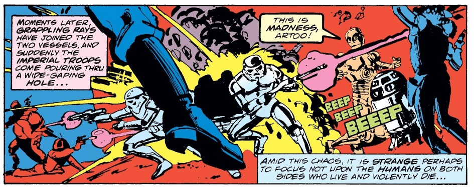
But the interesting thing was that it was not adapting the movie as such, it was clearly working from the screenplay, as there are scenes in there that never got used, and the designs of the movie were not finalized yet, so we encounter lots of interesting things in there which never, or nearly never, showed up again. These get less over the course of the adaption already, but the usual Marvel style and colors of the day never really disappear.

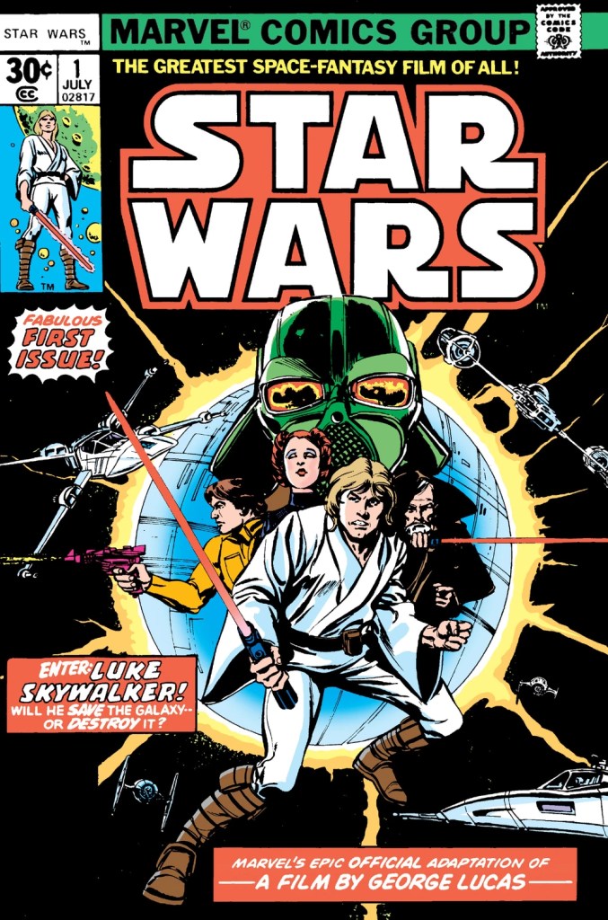
By the way, regarding the cover: at what point is Luke in this movie ever in a position to destroy the galaxy?! Also why is Vader green? I mean, it suits him, but still…

picture of pitched battle with C3PO stating "This is madness Artoo"

This looks much more like an action movie than the movie actually ended up looking like, despite it being Star Wars and everything.

comic panels showing Luke arriving in Anchorhead and greeting Biggs

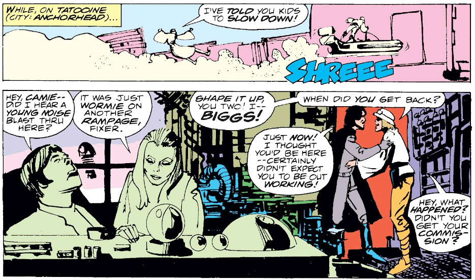
You might not know that there’s a hole scene set in Anchorhead where we are introduced to Biggs (who we meet later on Yavin IV) and Luke’s other friends. The scene can be found on YouTube, unfortunately the only footage is so destroyed that they didn’t even attempt to put it into the Special Edition, leaving Biggs as a somewhat obscure character forevermore. On the other hand the scene was called “American Grafitti in space” before, and it would have sucked out a lot of energy from the beginning of the story.

Vader leading a humanoid looking interrogation droid into Leia's cell

I just want to note that this is the torture droid that comes into Leia’s cell. Another one of these designs that don’t come from the movie itself. Also note the pink walls of the Death Star.

Han meeting a simian looking Jabba the Hutt

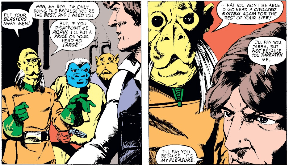
Oh look! It’s our favorite Huttese… ape… person?

Yeah, the scene was filmed back in the day, and it was intended to replace the stand-in they used for filming it with special effects monster (although who knows if that wasn’t Lucas fibbing again), before simply giving up on the scene altogether. They later redid the scene with the worm-like Jabba for the Special Edition in 1997 and used a CGI overlay for that.

The ape-like Jabba the Hutt from the comics reappeared in the comics a few times more, before the release of Return of the Jedi and the slug-like Jabba made him disappear into a puff of retcon-scented smoke.

The Millenium Falcon dodging the shots of curiosly small looking Star Destroyers

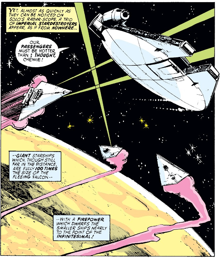
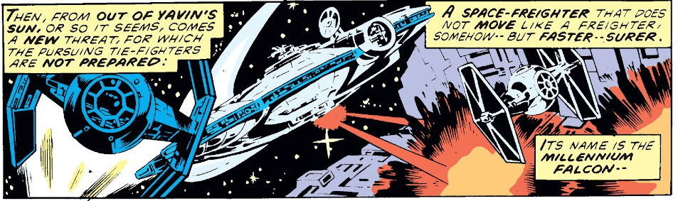
The fun thing here is that we don’t have a clue how big those star destroyers actually are from the picture. If we hadn’t seen one in the very first issue I’d have thought these are way smaller crafts and not the massive dreadnoughts that appear on screen. In fact the previous issue doesn’t really help with that either, as unlike the movie you don’t get a sense of scale in there. Likely because besides some basic design the artist didn’t have a clue what size they were supposed to be. Actually…

The Tantive IV and the Star Destroyer from the beginning of Star Wars, close by each other (the Destroyer is rather small)

…look at this panel from the first issue. This makes the Star Destroyer look tiny, tinier than the Tantive IV. I assume the artists didn’t know until the film actually came out how the sizes of these ships were to relate to each other.

By the way this makes it look very much like a S-Type scout from Traveller, which came about just a few months prior.

The Millenium Falcon jumping into hyperspace in a rather rainbowesque effect

This is a way more trippy way to depict hyperspace than the movie, and I think we all lost something when this was replaced with the usual starfield turning into stripes design. Yeah sure, they did it because they didn’t have a clue how it’d look in the movie. But look at it! It’s amazing!

Vader and Obi wan staring at each other over their light sabers

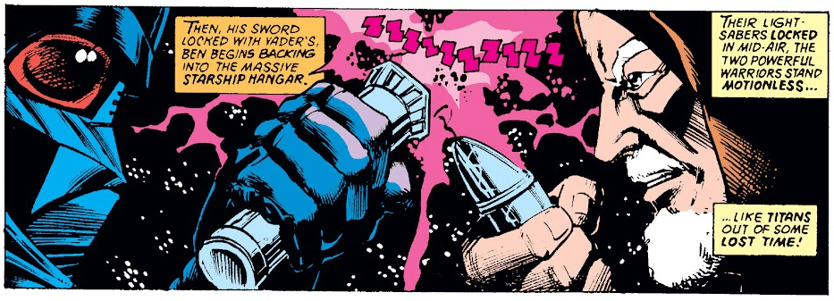
I do have to say that the fight between Vader and Obi Wan is way more epic than what we get in the actual movie. The movie makes it look like the fight between an old man and a paraplegic that it actually is, but of course back in the day it was the height of excitement. It wasn’t every day you saw a samurai cyborg battle a space warrior monk with laser swords after all. Unlike today where the glut of Star Wars media lately seems to have brought up excactly that.

Luke meeting his squad leader who seems to have known his father

This implies a very different story than what the prequels in the end gave us, yet it still fits with what we got in Episode 3 and the Clone Wars TV series.

The millenium falcong shooting at Vader and his pilots during the Death Star Battle

By the way the series is very interesting to read even after this. Clearly they were struggling with finding any story to tell, but the comic book was too successful to just end it. So the next few issues were about Han reenacting The Glorious Seven/The Seven Samurai with a green space rabbit and a delusional Don Quixote who believed himself to be a Jedi knight. It did get better, but the first few years seemed like a desperate attempt to somehow squeeze more material out of this one movie.

Rate this:

#1 #Art #comics #marvel #starwars #starwarscomics

Content Warning

For the next 24 hours, there's 25% off all my artwork over at my Inprnt store. Really good quality prints, in a range of sizes. Have a peek and snap up a bargain.

Use code: Q36EKY

https://www.inprnt.com/gallery/thisnorthernboy/

#Prints #Illustration #Art